Hi Evan, there seems to be a visual glitch with the 52W% indicator. This glitch can be seen in Safari (on Mac), Microsoft Edge (on Windows 10) and Chrome (on Windows 10) browsers, so it seems it may not be a localised issue with my device.
Thank you for reporting. I fixed it. Please verify.
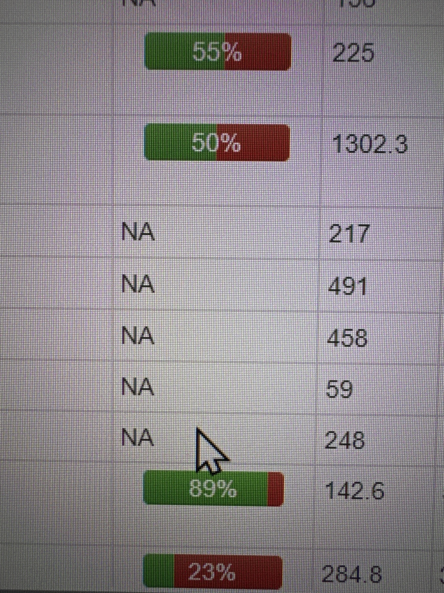
Verified fixed. But just a comment that the fix causes the row to break into another line (see image below). The “NA” for SSBs is also not centre-aligned. Just my OCD… ![]()
Okay. I made NA to be center.
As for the new line, I (actually mostly ChapGPT) could not figure out how to fix it ![]()
1 Like
May i check if the actual percentage could be smaller in font, or to be removed and replaced by hovering to see the %? I am not sure if this is the root cause for each row to be wider.
Because currently, it makes my list a bit long ![]() seeing less of my list due to the bigger chart.
seeing less of my list due to the bigger chart.
The font does not matter but I should be able to make the row shorter.
1 Like