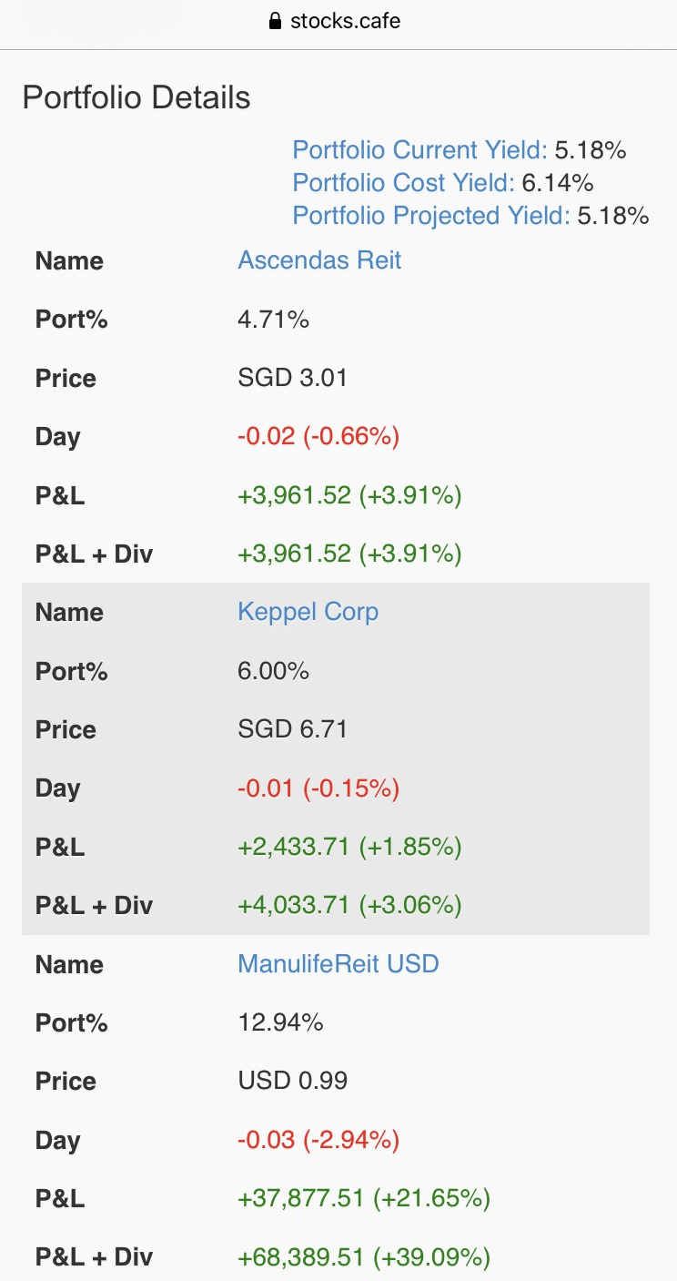
The whole layout is wasteful of space and requires much scrolling to move around. It would be useful to have a compact view in tabular form so that it is easier to see the portfolio.
A quick solution would be to use the mobile app from app store. It does have a better presentation. also, I intend to use the the last two weeks of dec to work on it more.
Hi Evan, thanks for the suggestion. I didn’t realize I was using the mobile web version instead of an app. I have installed the app now and see the little + sign to get more details. Consider me a satisfied customer.